simPODD
A CASE STUDY
A book meets an iPad application
At AssistiveWare, we designed products for those unable to communicate using natural speech. Here’s my process of building a subscription-based text to speech product.
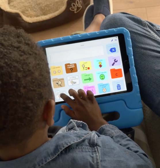
Photo by AssistiveWare
PROJECT DURATION
YEAR
12 months
2018
ROLE
I teamed up with another UX Designer, a Product Manager and a team of developers to design an MVP for simPODD. As one of the 2 UXers in a 20 person company, i wore many hats. My role involved product design, UX research, system design and market research and subscription model development.
THE PRODUCT
SimPODD is a text to speech communication app designed using the Pragmatic Organisation Dynamic Display (PODD) vocabulary system. It was created by Gayle Porter, an Australian speech-language pathologist. At AssistiveWare, we collaborated with Gayle to convert this system, originally designed as books, into an iPad application. Here's a bit about PODD.
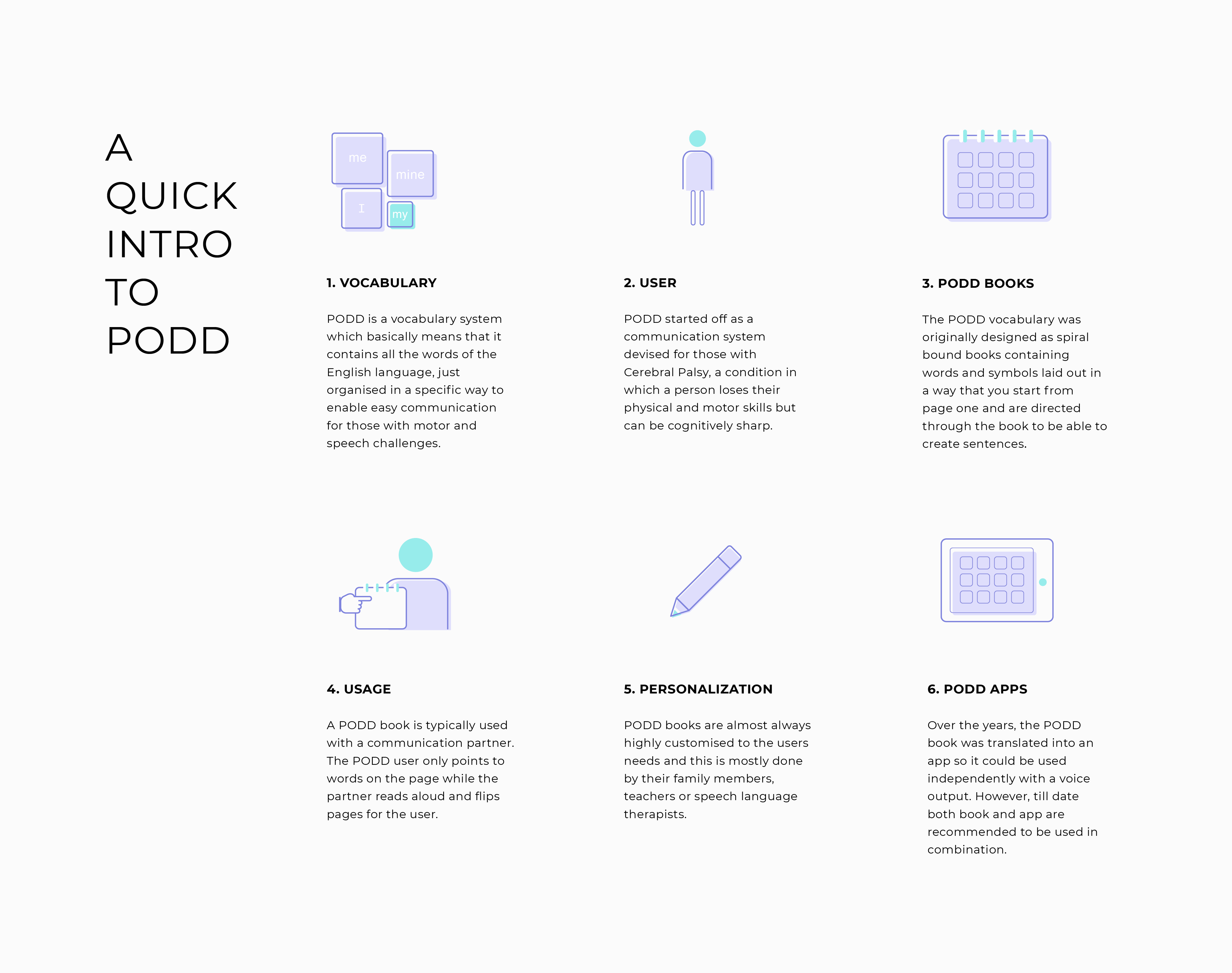
THE UNIQUE THING ABOUT PODD
It’s context-based communication where one expresses the context of the conversation and is then presented with words or vocabulary relevant to that context. Remember those 'find your own ending' storybooks? PODD works a bit like that. The user points to a word or context image, and the communication partner flips to a specific page linked to that word, and the conversation continues. Here's what it looks like in the app.
Turn on sound
DISCOVERY
SimPODD belongs to the world of Augmentative and Alternative Communication (AAC) apps. To understand this world better, our discovery phase consisted of:
- Visiting special education schools to see PODD and other AAC apps in use.
- Market research about existing PODD apps to find gaps and know where to add value to our product.
- User and stakeholder interviews with speech-language therapists, school teachers, and parents of PODD app users to learn about the unique way they all used these products.
- Interviews with the support team at AssistiveWare to uncover issues and feature requests reported by users in their current product. This was also an opportunity for us to learn from AssistiveWare's other products and design an improved one.
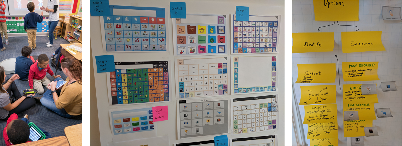
School visits in Orlando, USA
Competitor research
Breakdown of the vocabulary components
OUR TWO MAIN LEARNINGS
1. Using the existing PODD book, printing software was tedious. Users required reading heaps of documentation to understand how to set up, export, and construct their book.
2. Users found vocabulary editing in the existing solution difficult and, as a result, didn't update their child or student's books often enough.
"I have to export each page individually on the PODD desktop software. It can take me up to a month to customize, print, and construct a book."
- User (parent)
"We usually wait till my student has learned a few new words before adding them to the book since updating a book and printing it each time is a lot of work."
-User (teacher)
DEFINING AN MVP
The results of the discovery phase formed the base for an MVP. However, defining the entire MVP was a long process since there were multiple stakeholders, including Gayle, the creator of the vocabulary. Some of what we did to define the product was:
- Create a value proposition canvas along with the market research team.
- Participate in a workshop with the product owner to define the service model of the product.
- Identify a preliminary feature list based on knowledge gathered from users, stakeholder interviews, and competitor analysis.
- Conduct a voting and feature prioritization session with stakeholders to identify essential features and finalize the list.
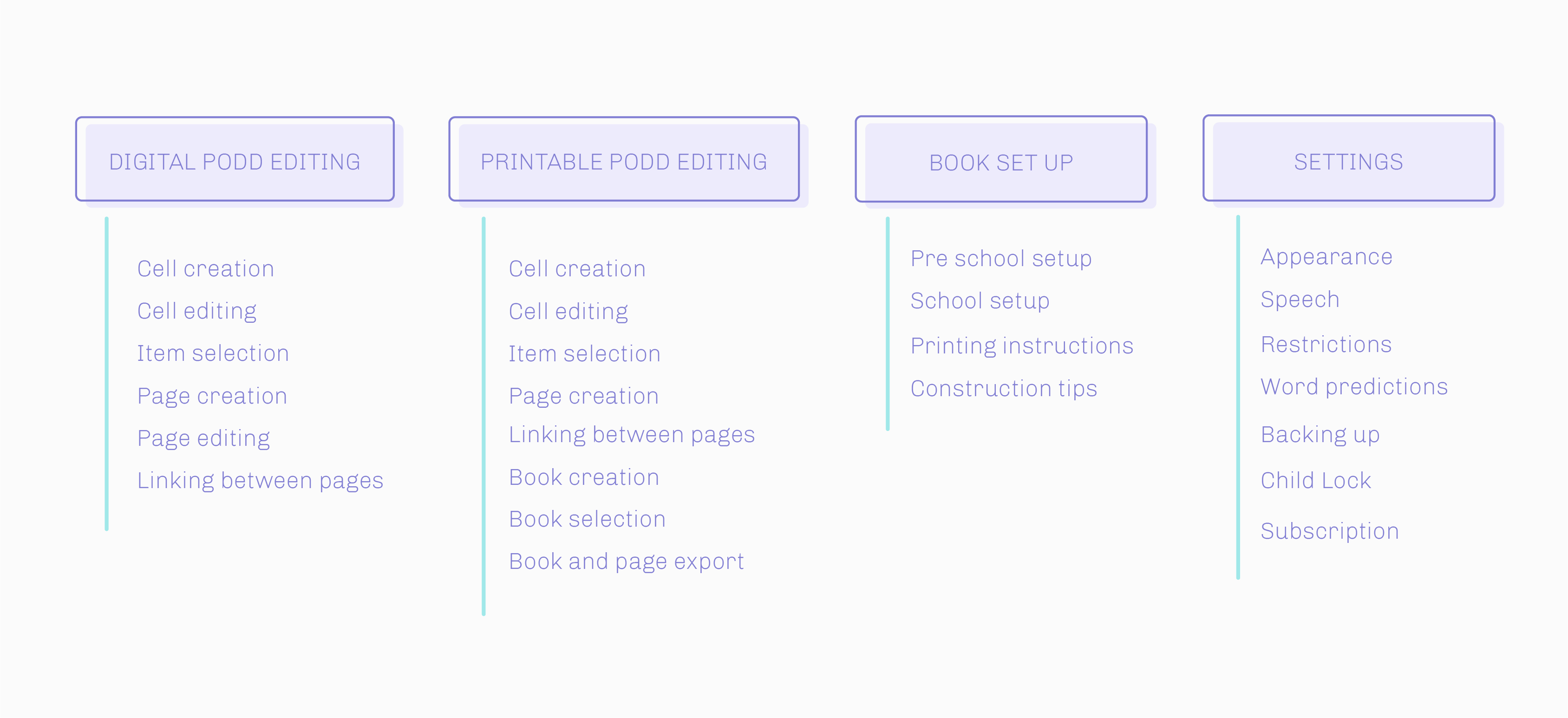
4 MAIN FEATURE BLOCKS
And a high level list of what they contained.
MODIFIED SPRINTS
Since all the features were interconnected, we designed one entire feature block per sprint, which lasted 4-6 weeks, depending on the block's size.
Each sprint consisted of ideation, design, prototyping, developer and stakeholder review, usability testing, and design modifications based on testing.
FOCUS
From a UX perspective, the biggest focus was on improving the editing functionality since that was a big pain point in the existing products. Here are some highlights.
1. A CONCISE EDITING INTERFACE
Based on our research and Mixpanel data from other AssistivWare products we knew that only a small percentage of users used very advanced editing. Many other users were overwhelmed by this feature. Hence we carefully selected the most essential editing functionality and later added a few other features after usability testing.
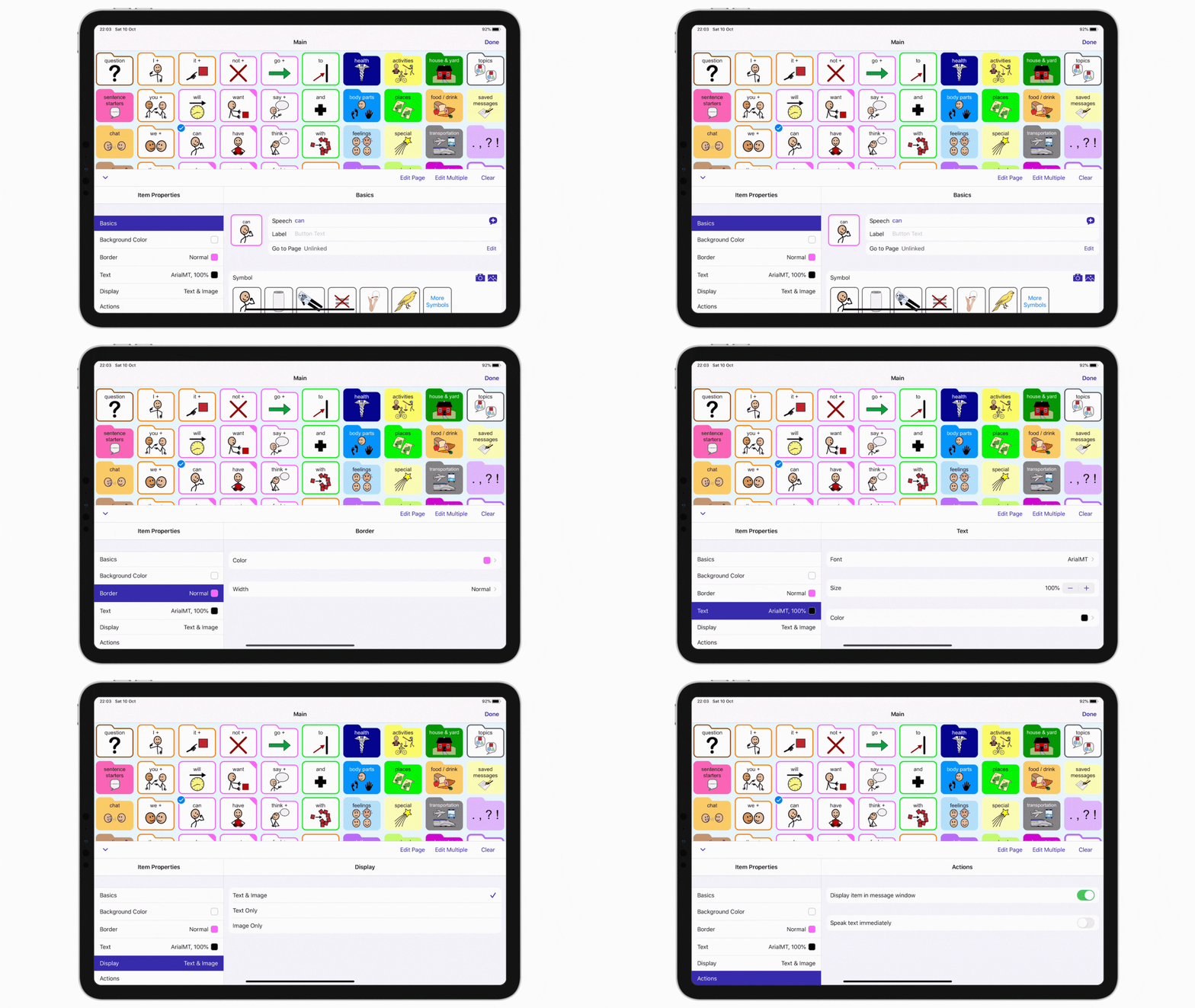
Main cell editing properties
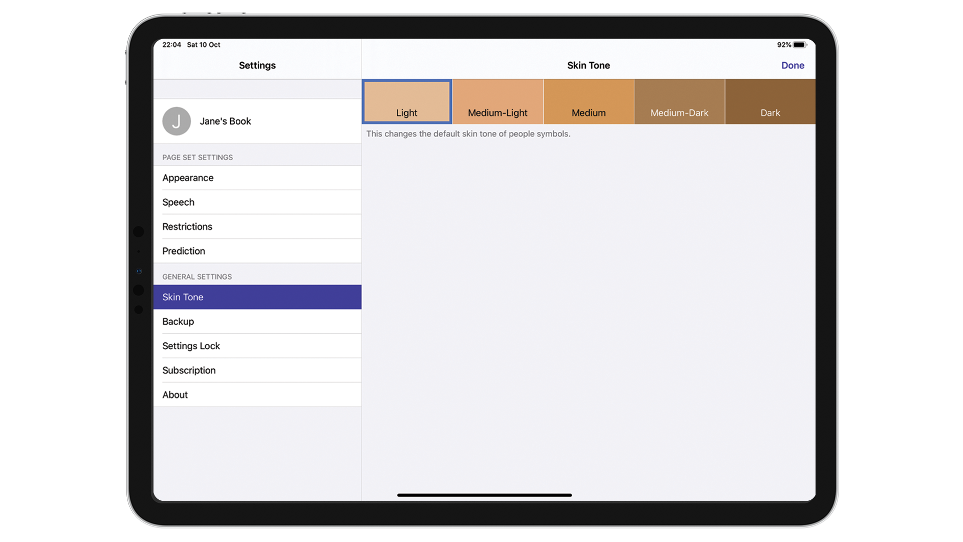
Additional properties like customizing the skin tone of the symbols
2. CELL SELECTION
In other products by AssistiveWare, one could select multiple cells just by tapping more than one cell one after the other. However, our research showed that users would accidentally edit multiple cells without realizing that their selection was larger than one cell. Some cells would be hidden under the editing menu making users miss their selection. To prevent this, we separated the possibility to edit multiple vs. single cells as seen below.
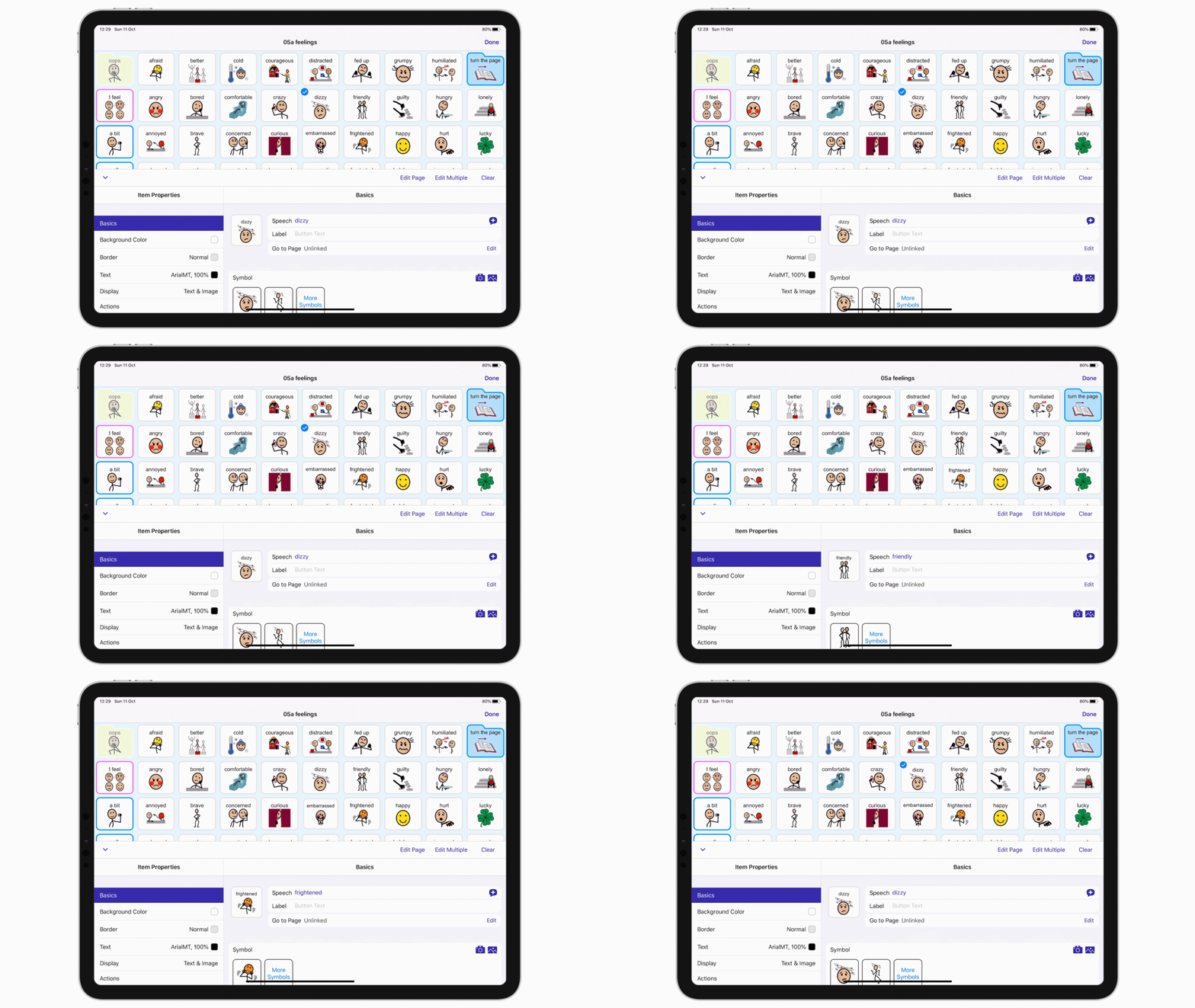
By default user always selects single cells

We introduced a button for turning on multiple cell editing
3. LINKING PAGES
Since PODD can be heavily customized to an individual, we provided a simplified way to change the page a cell is linked to. The same was also done for the books which updated and formatted automatically if a page was added or changed.
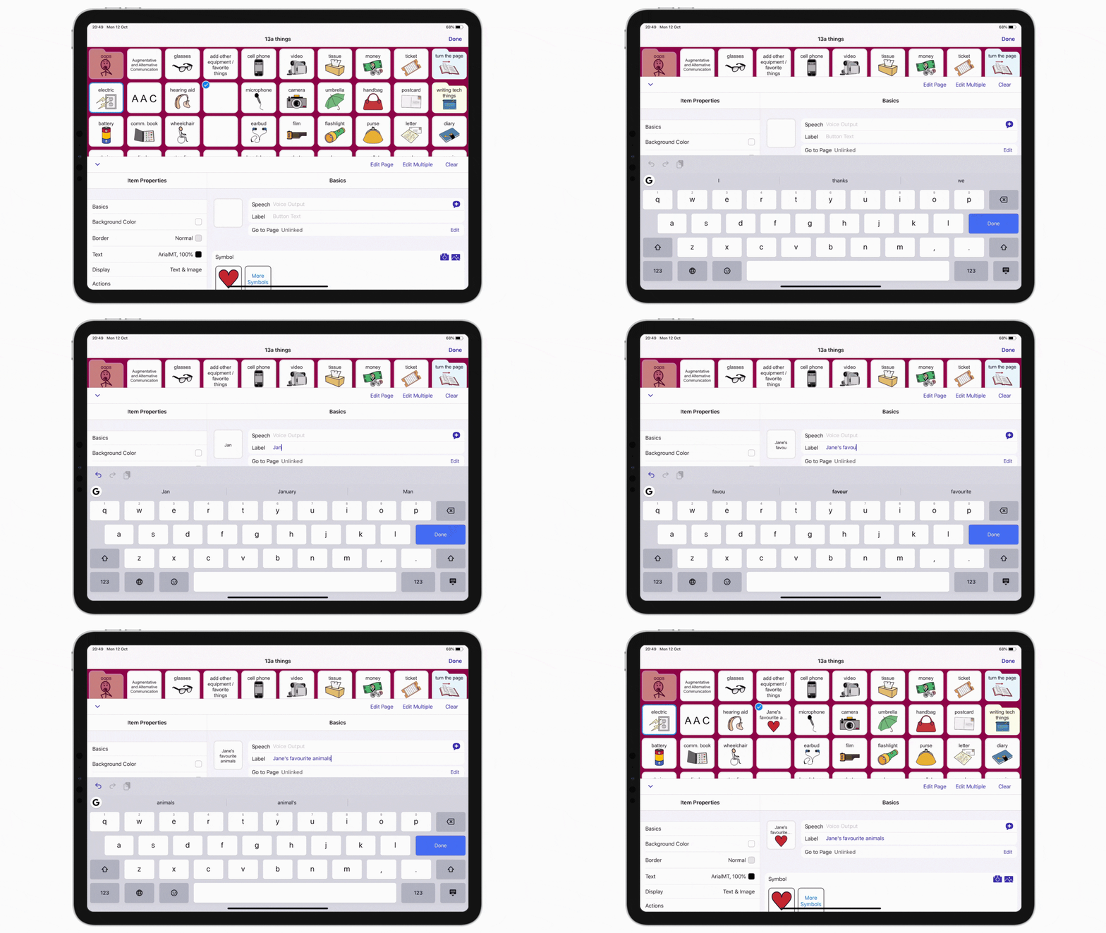
Adding a new cell
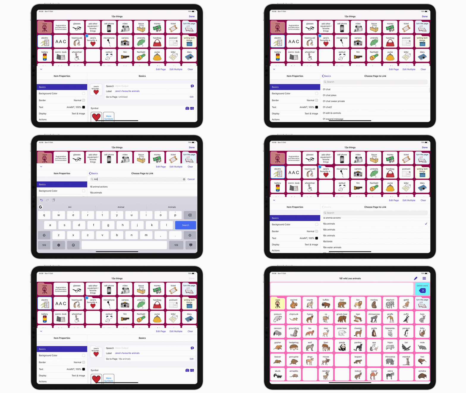
Linking the new cell to an existing page
4. EDITING, PRINTING AND EXPORTING BOOKS
In the printing section of the app, we provided templates to quickly allow our users to create high-resolution pdf exports pre-prepared for cutting and assembling. The editing interface of the books was designed very similar to that of the digital page sets to ensure consistency.
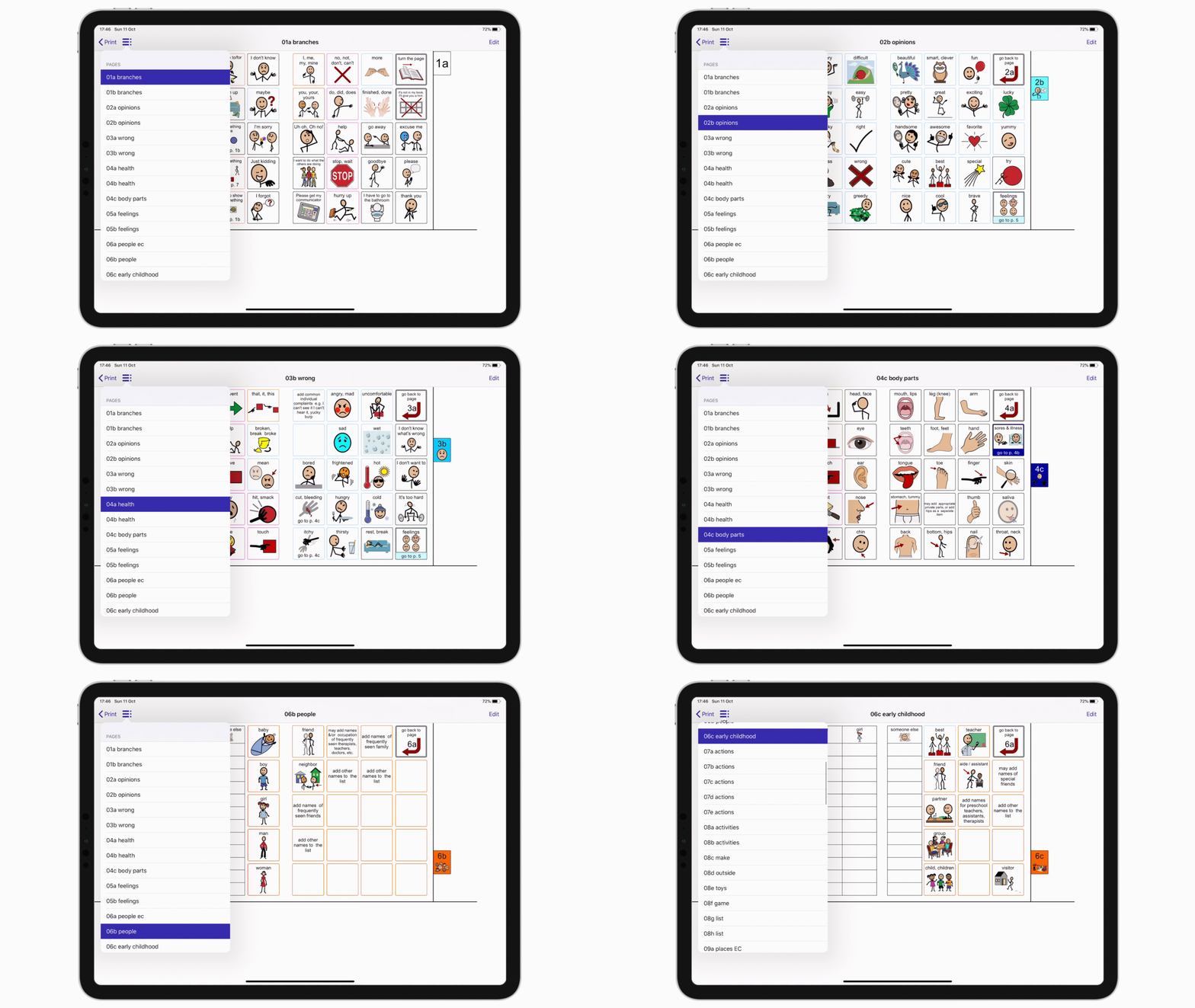
Quick editing access to all the pages of the book
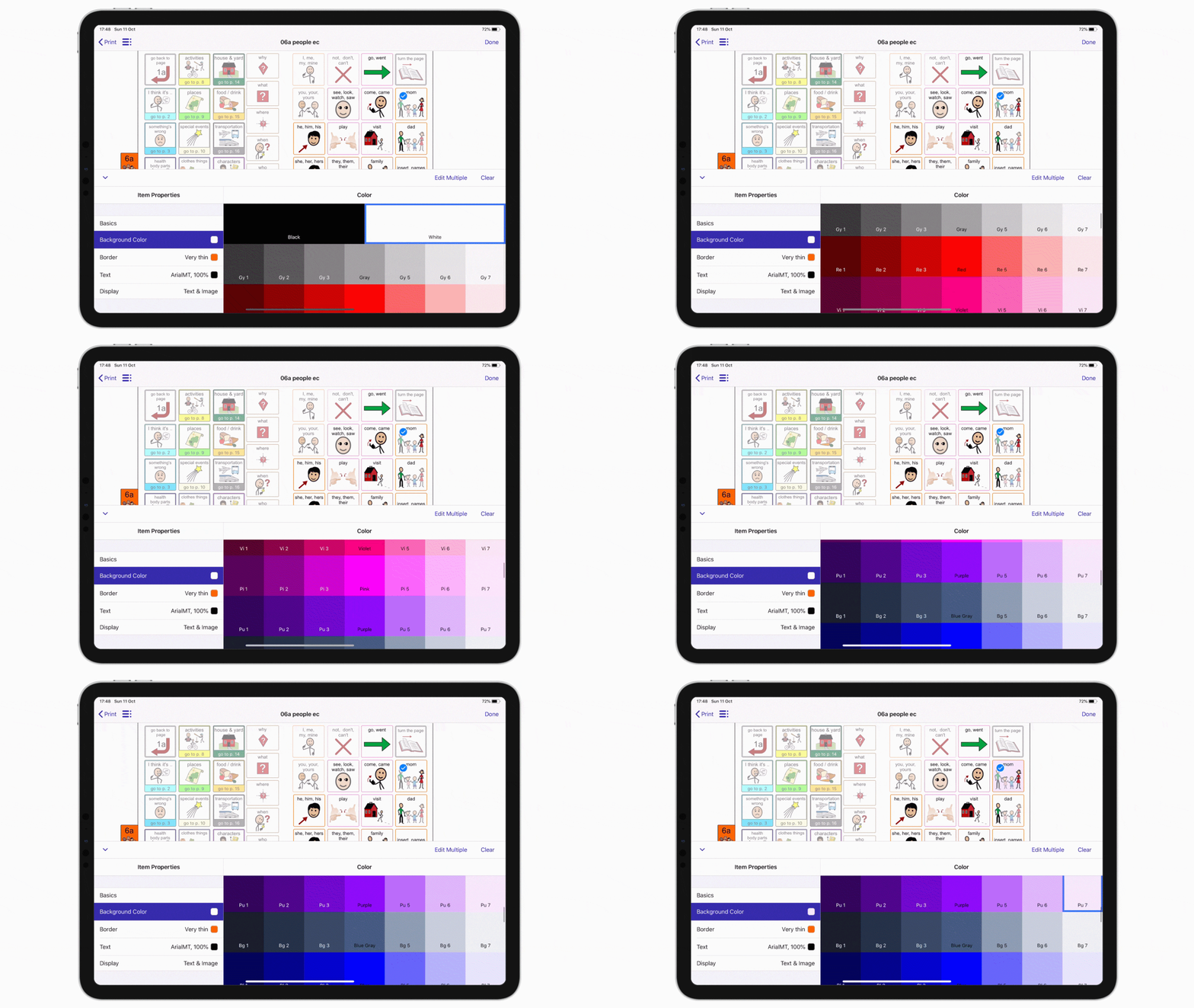
Editing cell color in the book
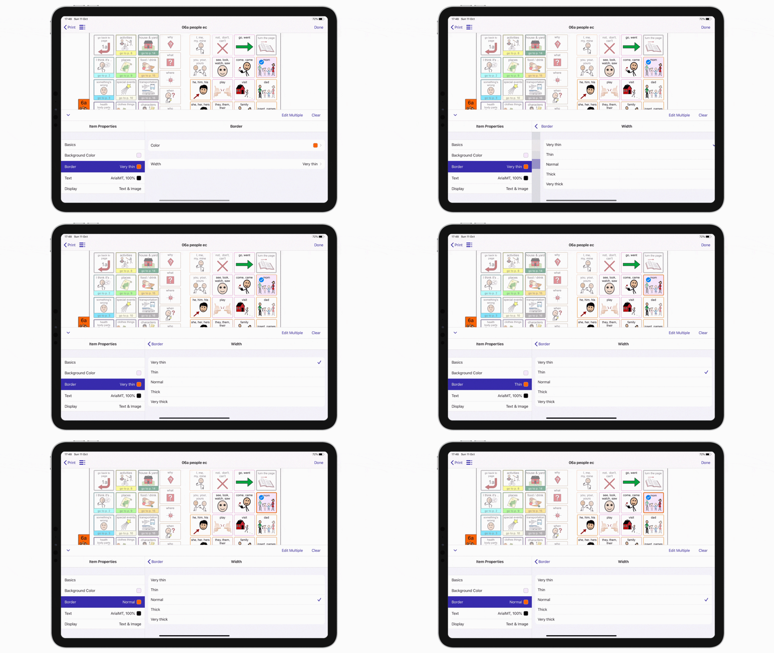
Editing cell border in the book
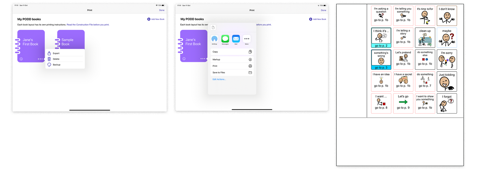
A page from the exported pdf
USABILITY TESTING
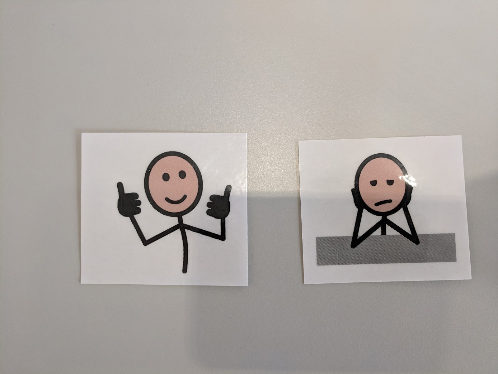
Testing was a key part of the process. The designs went through multiple iterations before they were ready to ship. Testing was done sometimes remotely with our users abroad and sometimes in our Amsterdam office. To add an element of fun, we would also ask the participants to pick a few of the language symbol cut outs to express their feelings after using the prototype.
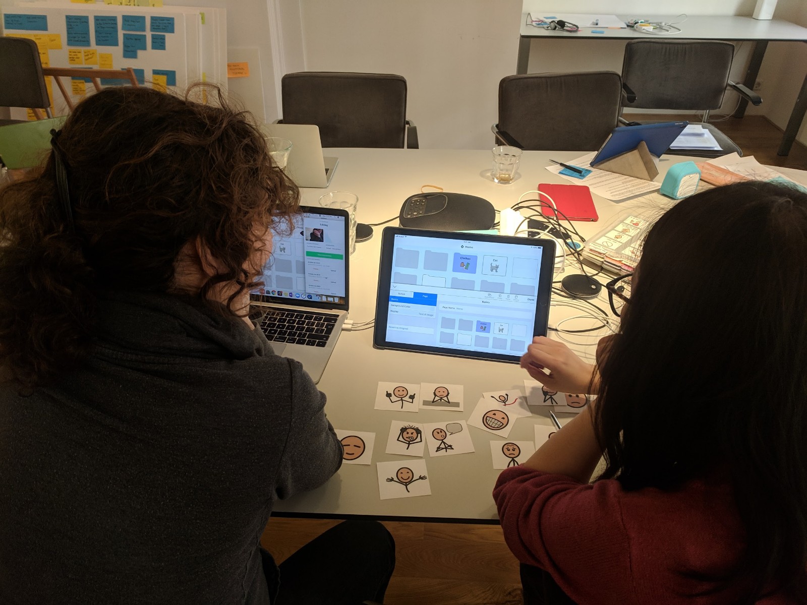
Testing at our Amsterdam office
Emotions were chosen for two different parts of the flow
LEARNING
Working in a small-sized company, I wore a lot of different hats. Something I learned doing this was how different parts of the company come together to make a product. Each team is crucial, be it support or marketing. This emphasized the importance of bringing different teams and stakeholders to work towards a common goal right at the beginning of a project.
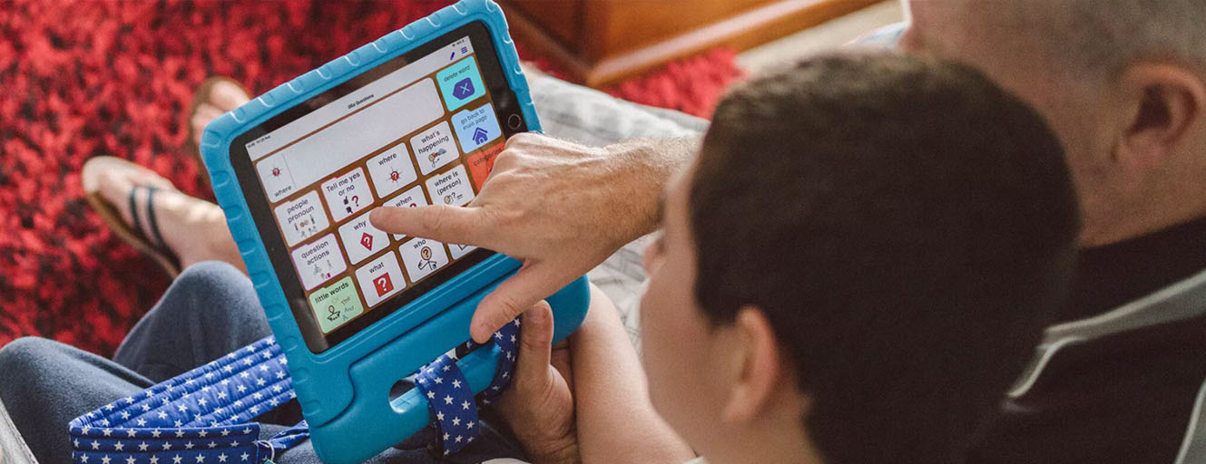
Photo by AssistiveWare